
All posts
How to Choose a Color Palette for Your Loyalty Pass
How to pick a color palette for your wallet loyalty pass that reads well in Apple Wallet and Google Wallet, with the rules and common mistakes.
Loop Customer Team··6 min read
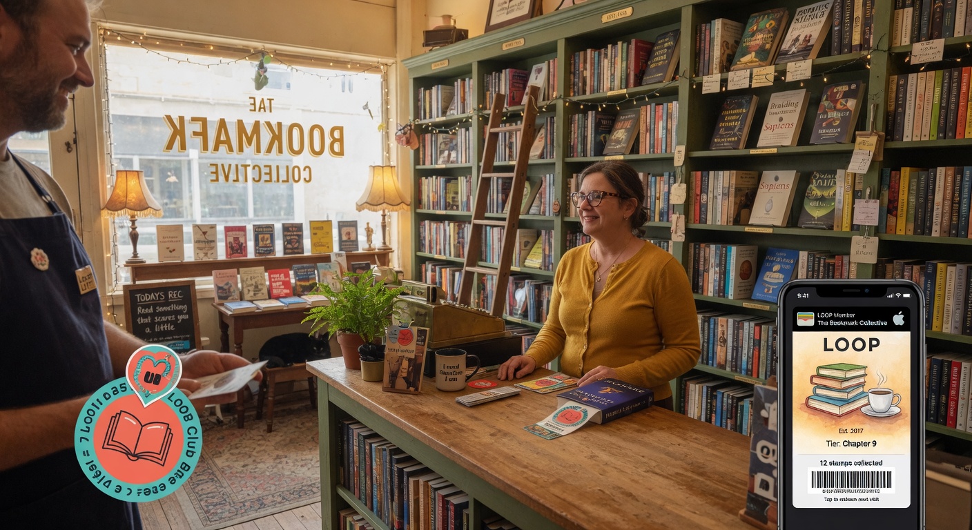
Color choice has a surprisingly large impact on whether customers keep your pass.
Small changes in repeat visits create massive differences in lifetime value.

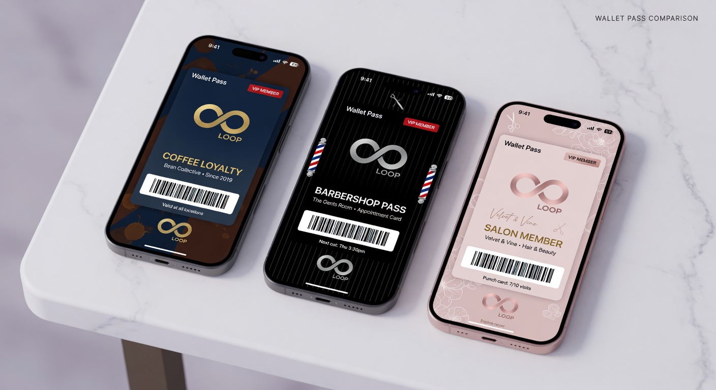
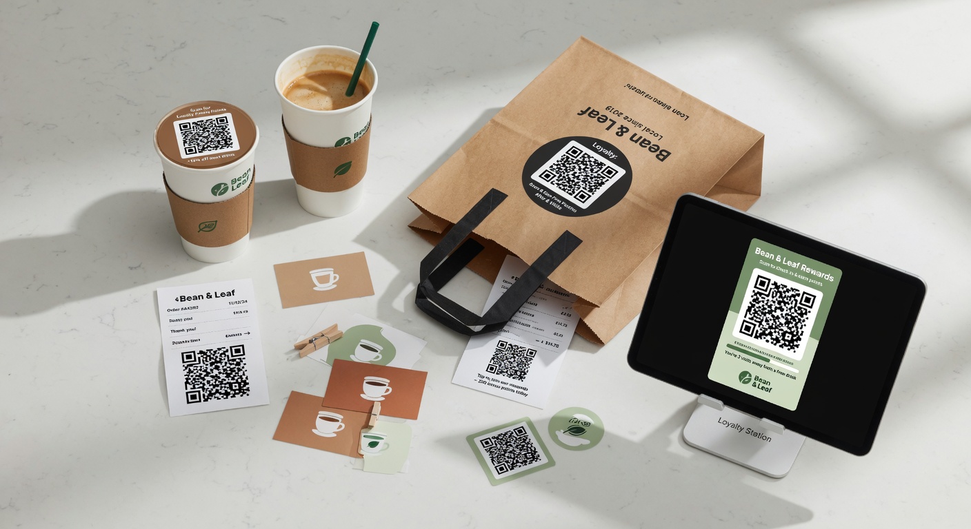
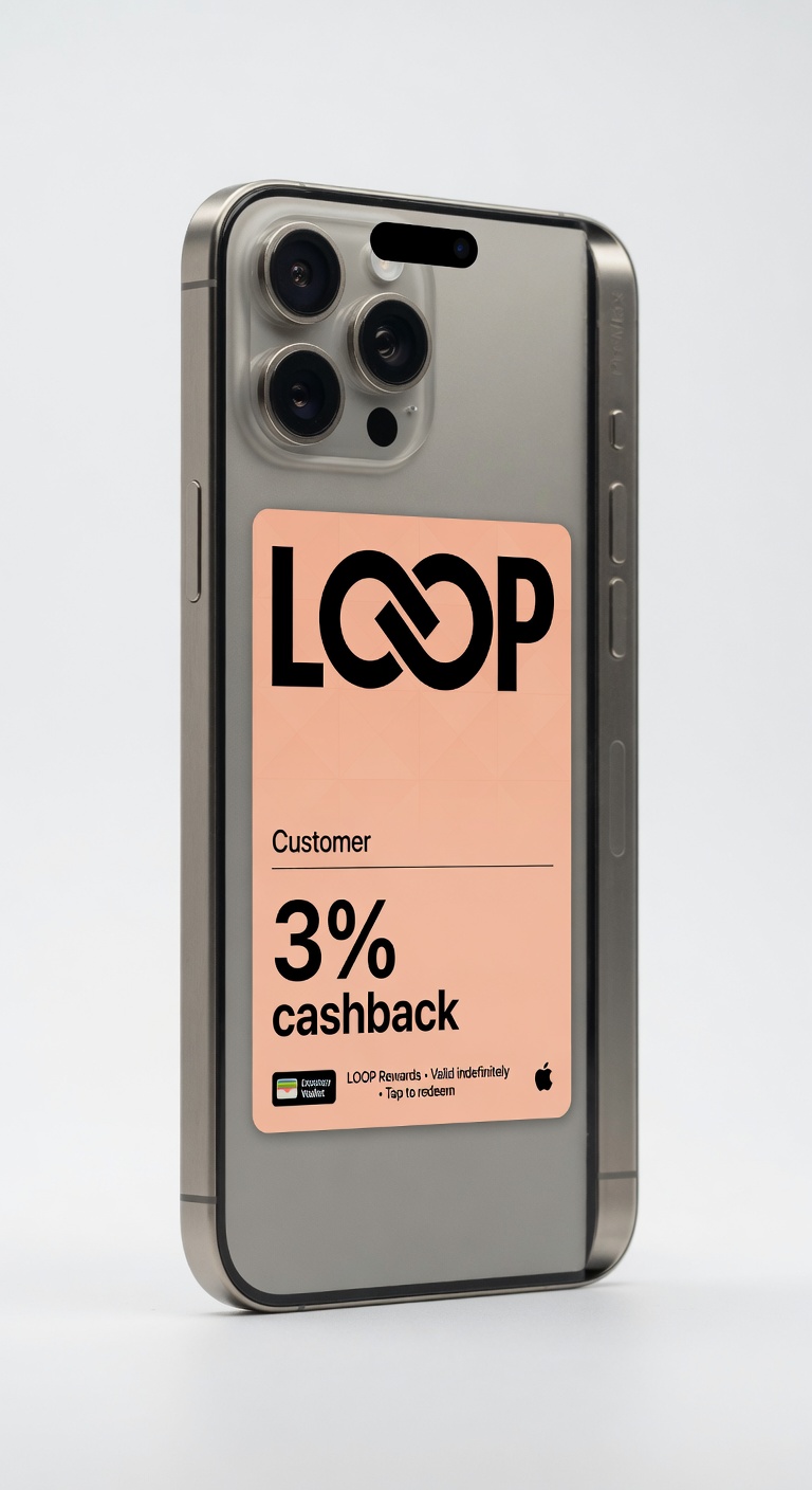
The rules that matter
- Use your brand colors, but test them in Wallet (some colors look terrible on the pass background)
- High contrast between text and background is non-negotiable
- Avoid overly bright or neon colors — they tend to look cheap in Wallet
The best passes usually use a restrained, sophisticated palette that feels like a natural extension of the brand.
Try it free
Run a loyalty program in 60 seconds
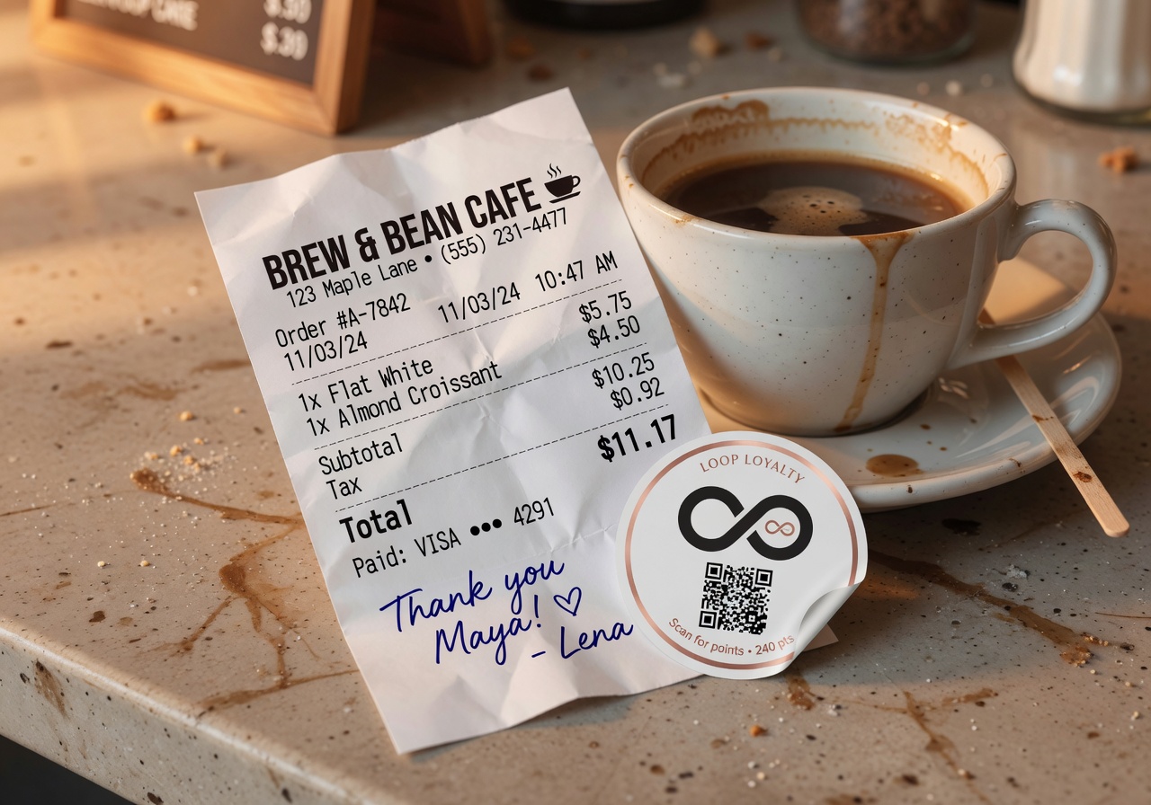
Loop Customer turns a QR code into a stamp card your customers keep in Apple Wallet or Google Wallet — no app, no POS integration.
Start free at loopcustomer.com/signup