
Designing a Wallet Pass That Customers Actually Keep
The design choices that determine whether a customer keeps your wallet pass or deletes it within a week. Colour, layout, copy, and the rules we follow.
Most wallet passes get deleted within days. The ones that survive follow a few simple rules.

The rules that actually matter
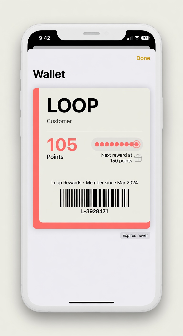

Contrast is non-negotiable If the text is hard to read against the background in bright sunlight, the pass is dead.
One clear job The pass should instantly communicate "this is my loyalty card for X". If it tries to do three things, it does none of them well.
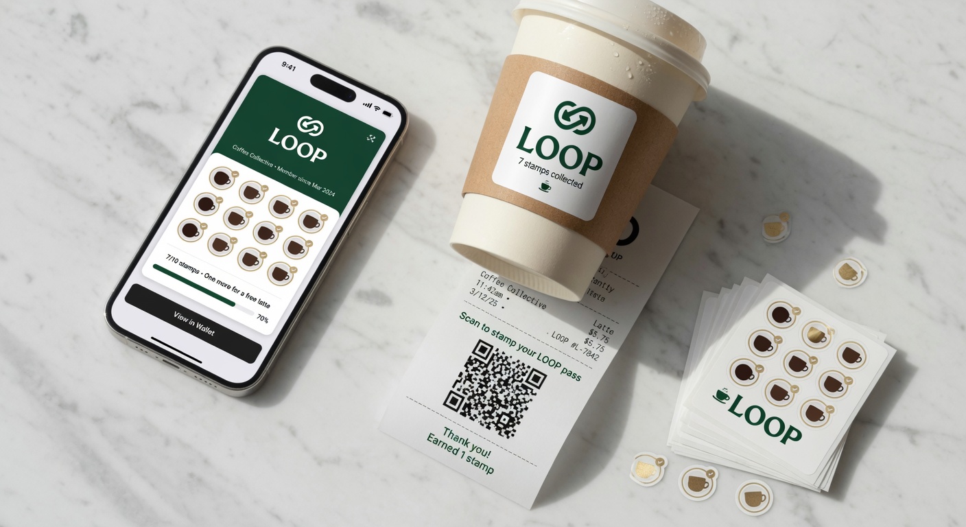
Progress must be visible Customers should be able to see how close they are to the reward without tapping anything. This is the single highest-leverage design decision.
Logo and name must match the real world If your sign says "Maria's Coffee" but the pass says "MariasLoyaltyPass", customers will not recognize it.
Strip image (the banner at the top) should earn its place Most strip images are just decoration. Use it only if it genuinely helps the customer understand the reward or the brand.
The test
Show the pass design to a stranger for 3 seconds. Then hide it.
Can they tell you:
- Which business it is for?
- What they need to do to get the reward?
- How close they are right now?
If not, the design failed.
Try it free
Run a loyalty program in 60 seconds
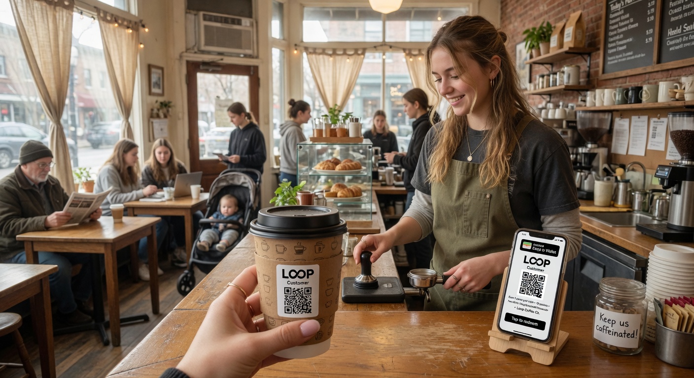
Loop Customer turns a QR code into a stamp card your customers keep in Apple Wallet or Google Wallet — no app, no POS integration.
Start free at loopcustomer.com/signup